Monster Books is getting its Spring 2018 catalogue ready, so I’ve been grappling with front covers over the last few days. Like ice skating, eating porridge and shopping for new trousers, it’s an activity I think I should enjoy but, actually, I don’t.
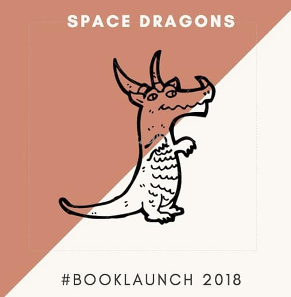
I love going to galleries or looking at pictures on walls in other people’s houses but trawling through cover art sites online puts me to sleep and the results always come out blander and more generic than hoped. For example, I’m looking at cover artwork for Space Dragons (pub date June 2018). As the title suggests it’s got dragons … in space!
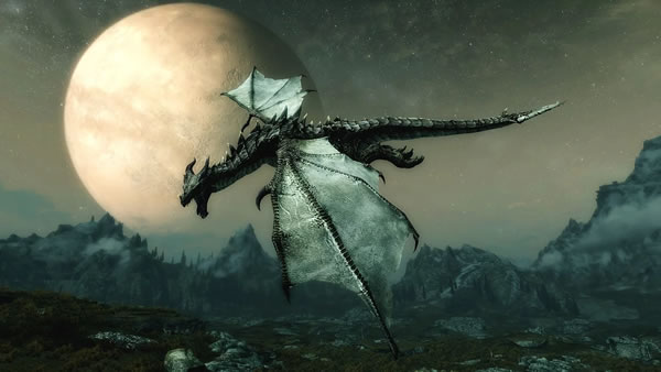
As it has a 9-12 target audience, most off-the-shelf cover art can be immediately discounted on account of exactly 70% of the dragon picture population also features partly naked ladies draped across scales or cowering lustily (which is a thing) in the foreground.
When I shop for trainers or watches I usually start by liking the first thing I see, then moving up the bling scale until I’m seriously looking at gold lame running shoes with a diamante Nike logo or a diver’s watch that would drag me under the minute I went in the water. Then, quite abruptly, I lose interest and go beer shopping instead. With these dragon pictures (minus soft porn), I started quite arty, then starred ones with explosions (there’s explosions in the book), then ones with explosions AND planets, then dragons burning things, that exploded into planets, then lots of planets (on fire) and several dragons, all exploding.
Then I decided to have just a black cover. To be mysterious.
I guess the answer is to commission something and this is what I usually end up doing and hang the expense. I have recently done this with SPLAT! (picture book combining a food fight with healthy eating for pre-schoolers) and have commissioned the talented Kate Shannon who nailed it virtually first sketch.
Then there’s the cold war with the designer and publisher: most designers I’ve ever met want something tasteful you could hang in the downstairs loo – usually this means a large picture and tiny writing.
This has never helped when it comes to selling a book but, more than ever, cover art needs to work as a thumbnail (on Amazon etc), so the title and the author’s name needs to be legible even at a couple of centimetres across on a mobile and the picture needs to be bold.
Recent Comments